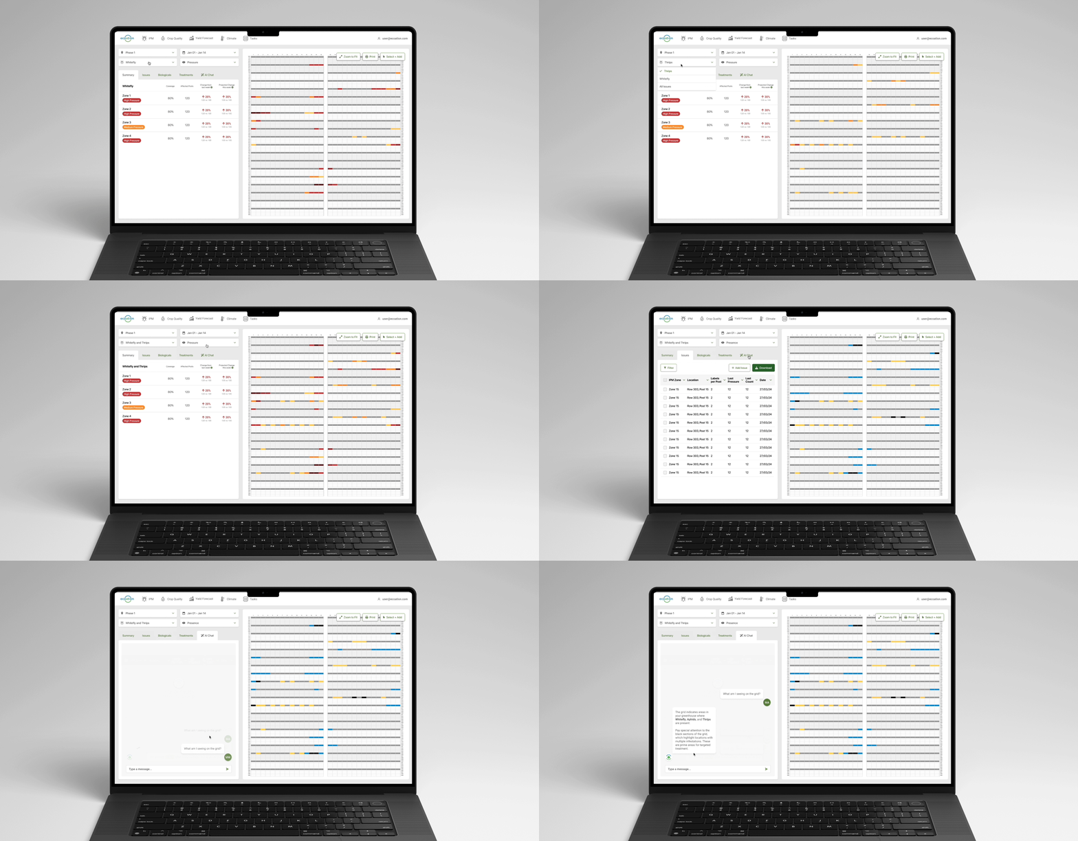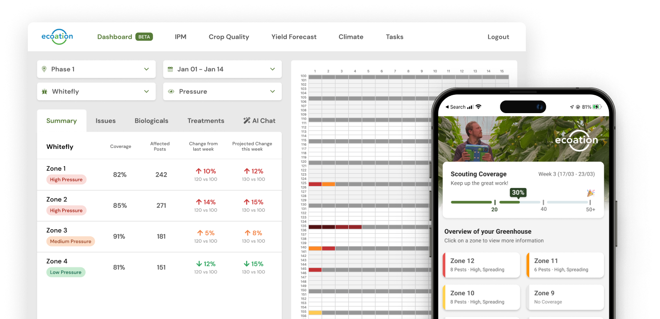
Ecoation, a Canadian agritech startup, offers a web and mobile platform that allows users to add, manage and view their greenhouse data.
Users want to view multiple data points on a single map so that they can make better decisions.
This project is scheduled for production launch in Q3 2024. Our goals are to enhance 90-day user retention, increase engagement frequency, and reduce time to value for new customers.
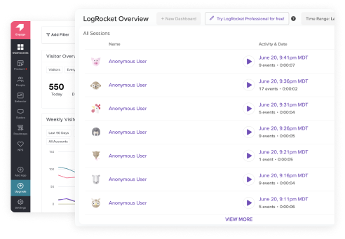
77% of our customers had requested the feature when engaging with our Customer Support team, and after interviewing a subset to explore the problem space, we were able to get clarity on the user pain points.
Our research enabled us to effectively capture and articulate the 'why' through the user stories outlined below. These stories functioned as valuable customer artefacts, providing a reference point throughout the design phase.

I want to overlay a pest and virus so I can gain insights into their transmission dynamics.

I want to view multiple pests at once, so that I understand the relationship between pests and treatments.

I want to compare outbreaks with temperatures, so that I can understand the impact of climate on pests.
My design process began by examining competitors within the AgriTech sector and exploring other industries or applications that implemented a similar overarching principle of displaying multiple data points in a single view.
 AI Use-Case
One application of ChatGPT in a designer's toolkit is its ability to provide examples of applications or companies that utilize niche UX patterns, offering visual references for design inspiration.
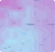
Weather Radar Maps
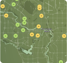
Environmental Maps
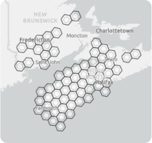
Ecological Maps
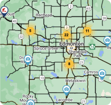
Traffic Maps
In this project, beyond visual design and layout, our primary focus was to determine the value of the data presentation.
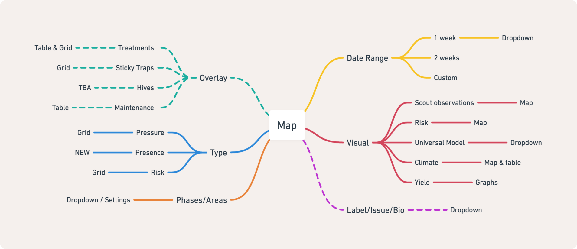
Here is a before-and-after comparison of our refined design solution, following extensive research and testing.
This project is currently under development and is scheduled for release in Q3 2024. Stay tuned for more updates in the upcoming months.
