Famous Brands, a South African fast-food conglomerate that operates over 2,800 franchises nationally
Users were spending too much time on the home screen, often selecting a store that would not be able to serve them.
The bounce rate on checkout decreased by 14.55% as a result of users choosing the right store. The average time on the home screen also decreased by 3.16%
Users were not happy with the home screen of the app and we noticed this in the following:
To validate the problem and understand the ‘why’, I set up in-person usability tests with some of our demographic and below are the findings I presented to the broader product team:
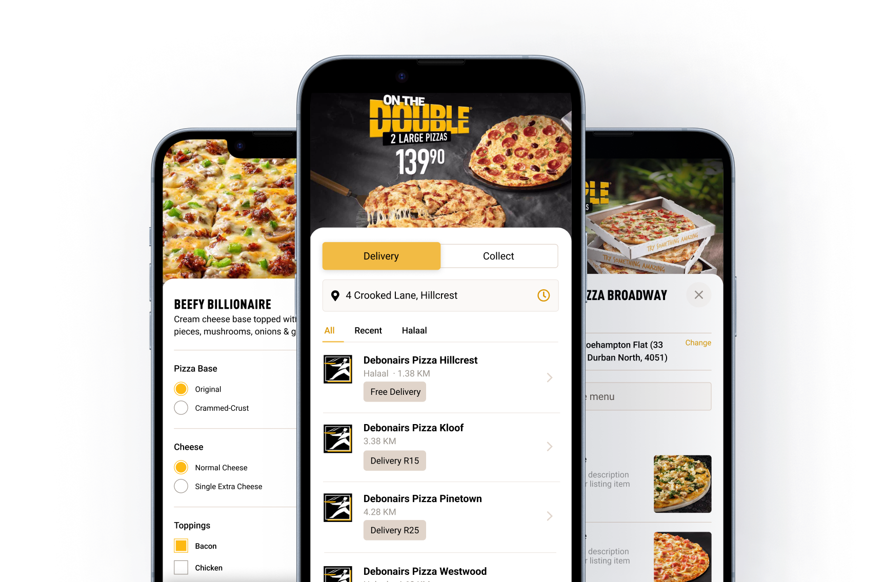
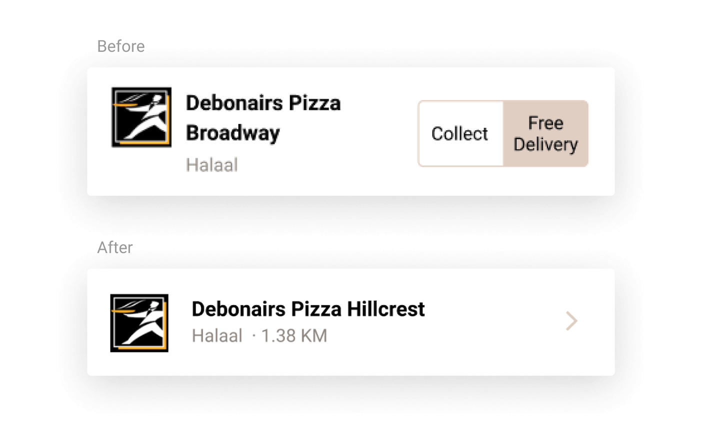
Every branch in a 10km radius was being shown, regardless of whether they could deliver to them. Each listing also had too much irrelevant information.
Users weren’t aware they needed to choose a store to start an order. Some users opened the hamburger menu, hoping to find a link to the menu.
Users were tapping ‘Delivery’ on a delivery/collect section of the listing that wasn’t clickable. This shows that the design was unintuitive.
The client was B2B (Famous Brands sold fast-food franchises to franchisees) but the app was B2C (customer ordering food from on franchise) so we needed to balance the user needs with the following business constraints:
Fewer store options lead to shorter page visits, aligning with Hick's law that more choices increase decision time. The apparent fix was to streamline store choices, enhancing relevance and reducing cognitive overload. Previously, the app overwhelmed users with 15+ stores, many irrelevant.
The path forward? Show only what truly matters.

What seemed like a simple solution became significantly more complex when we realized there were 12 potential states we needed to cater for.
After many (and I mean many) collaboration sessions between myself, the product owner and the lead developer, I put together this flow diagram of the relevant states and what design would be shown.

With the states enumerated and UI components designed I started on the developer handoff:

Following best practices, we documented initial metrics and defined clear targets for success to measure our improvements against. Below are the outcomes that resulted from the design changes we implemented:
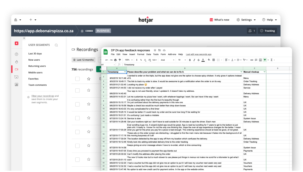
In addition, we monitored the frequency of keywords in user reviews and there was a significant decline in store selection complaints.